


Trading Cards
Having been involved in the orange county punk scene, I created this series of piercing trading cards based around its culture of metal and punk rock. I aimed to cover the dynamic, grimy nature of the scene, utilizing asymmetrical angels, metal name plates and ragged edges. Illustrations highlight the vast diversity of the scene and its people of all ages, styles, and of course piercings.


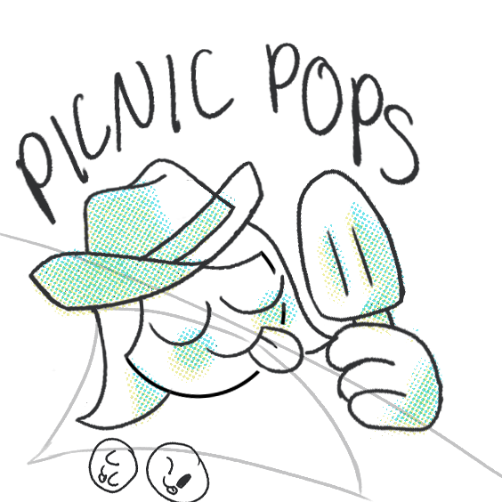
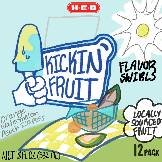

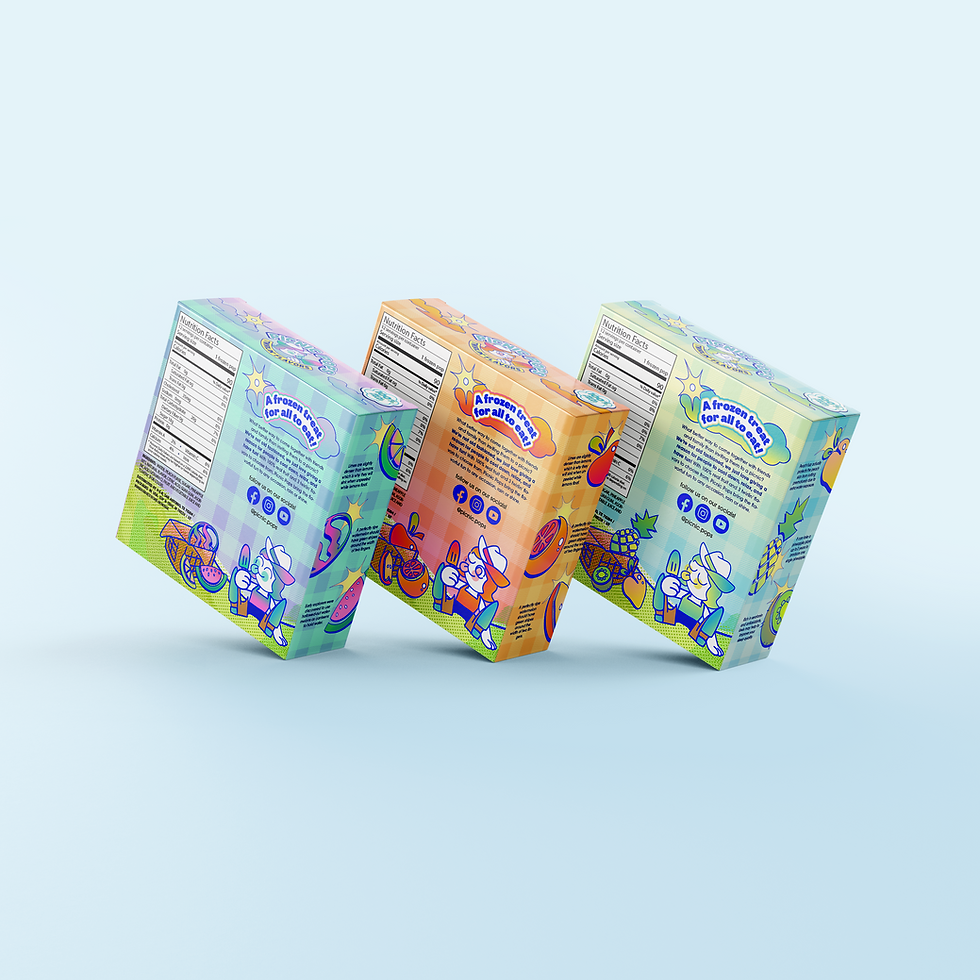
Popsicle Packaging
Picnic Pops is a fun eccentric popsicle brand for both kids and adults alike. Finding inspiration from the spirit of summer and the inclusive nature of picnics, I designed this packaging with the intention to spotlight the bright vibrant personality I closely associate with this dessert. Using bold dynamic type, soft gradients and a mascot, my goal was to create exciting visuals with refreshing flavors that anyone could enjoy.


Ad Campaign
Hidden between the Cape Fear River and the internal coastal highway, Wilmington is a charming hole-in-the-wall city disguised as any normal port city to the naked eye. Cozy, mellow, and friendly, each print ad is written as a diary entry, describing a scene in Wilmington.


Liner Notes:
'Time & Place'
“Time & Place” is an album that delves into the concept of the past, physicality, and loss. Going fully instrumental for the album, the group recorded songs using old machinery, from broken printers to tape recorders; A return to objects symbolic of painfully delightful memories.
With this oxymoronic idea in mind, I designed with a focus on nature and hardware. I used eucalyptus leaf exoskeletons to illustrate the fleeting yet lasting impact of nature and memories. Thin lines emulating wires highlight the sense of tangled confusion, contrasting the theme of nature, yet somehow feeling at home next to it. The overall scattered, dreamy yet stark design reflects the album’s main idea of the turbulent, unpredictable nature of life.


Scroll down to see my projects!
